![[EN] HPE Morpheus Enterprise WhiteLabel Configuration](https://kadirkozan.com/wp-content/uploads/2026/05/hpe_morpheus-ikona.jpg)
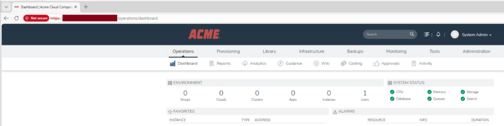
HPE Morpheus Enterprise is a powerful platform that enables organizations to manage their cloud management processes through a centralized interface.
One of the key features of this platform is the ability to customize the interface to match the organization’s identity.
HPE Morpheus Enterprise comes with a default installation that highlights the HPE brand in its interface. However, most organizations want to present the platform to their users with their own corporate identity. The WhiteLabel section addresses exactly this need: it allows you to fully adapt the interface to your own brand — from the logo to the color palette, from the login screen to the footer text.
This configuration is particularly valuable for service providers, MSP companies, holding structures, or organizations serving different customers/business units. Different brand identities can be defined for different tenants on the same Morpheus infrastructure. As a result, end users experience the system as if it were a portal belonging directly to their own organization or to the company providing them the service.
In this article, I will cover what each setting under WhiteLabel does, how it should be used in which scenarios, and frequently encountered tips.
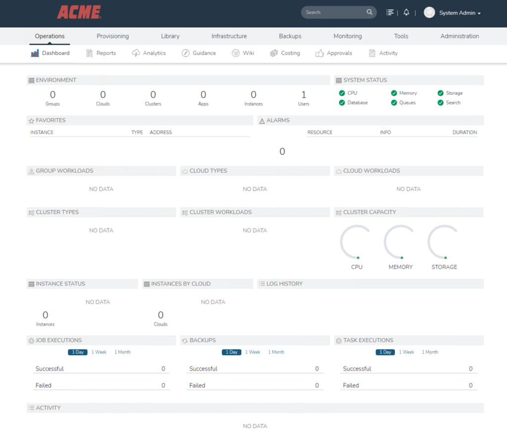
To access the WhiteLabel settings in HPE Morpheus, navigate to Administration -> Settings -> Whitelabel within the HPE Morpheus Enterprise management screen.
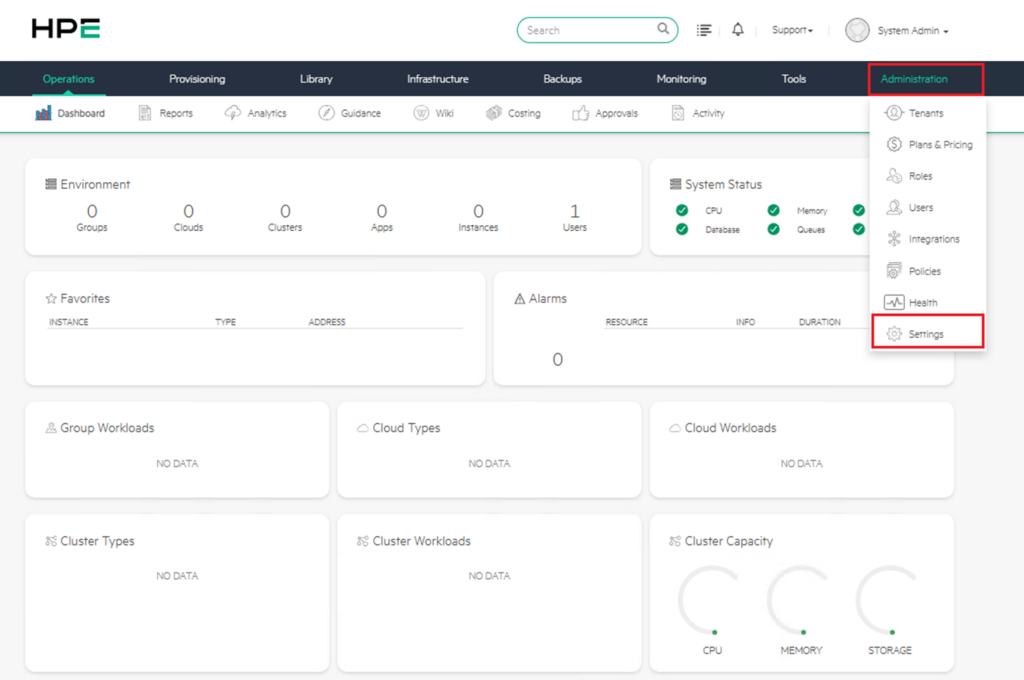
In HPE Morpheus Enterprise, the Whitelabel section presents settings under 3 main headings:
- Whitelabel Settings
- Colors
- Copy
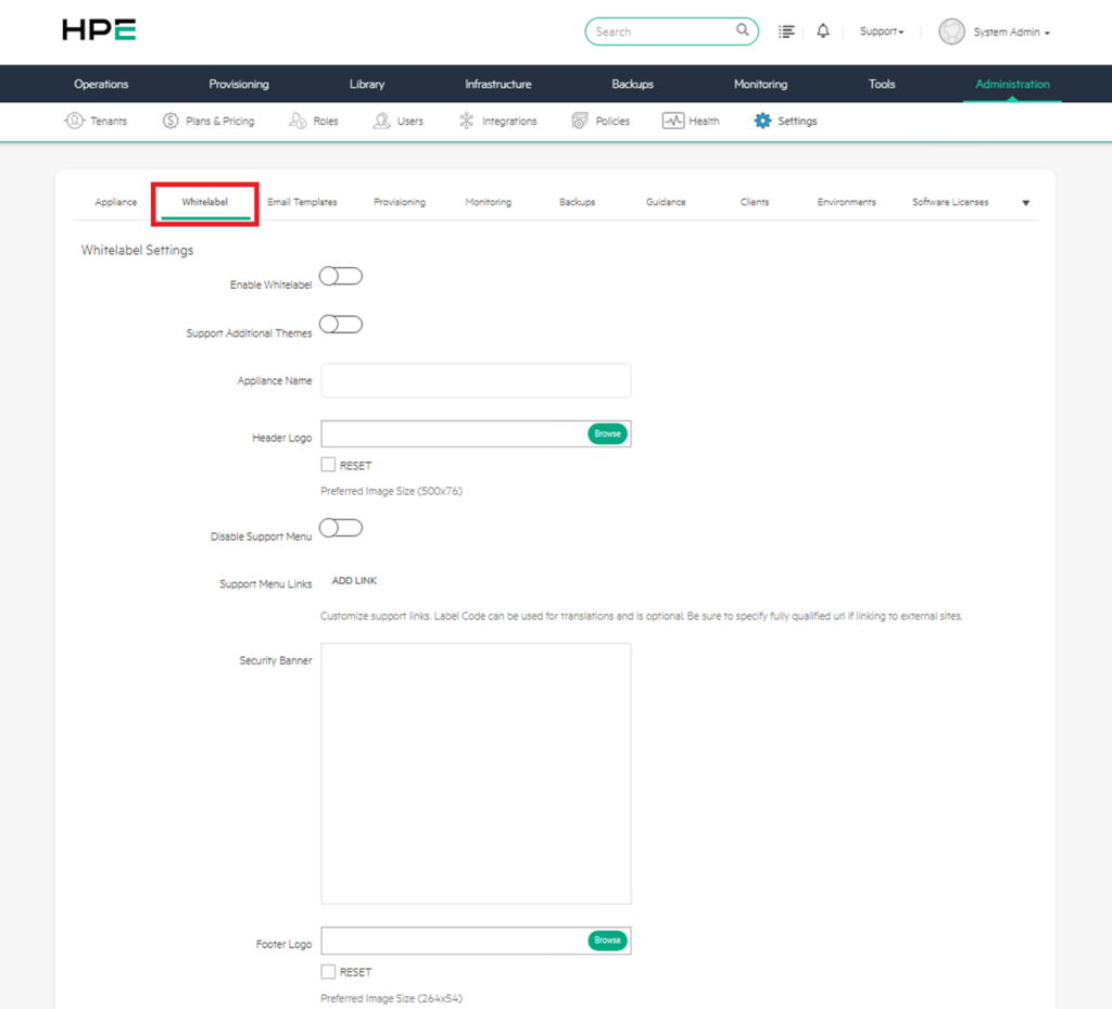
a) Whitelabel Settings
The WhiteLabel section is used to customize the Morpheus interface with your organization’s brand (white-labeling / branding).
Every setting made in this section directly affects how users perceive the system.
Below you will find the function of each field and practical usage recommendations.
1) Enable Whitelabel
This option is the main on/off switch for WhiteLabel features.
When enabled, the HPE Morpheus brand is hidden and all the custom branding settings you configure below take effect.
As long as the toggle is off, no matter how much you fill in the other fields, the HPE brand will continue to appear in the interface. Therefore, configuring the other settings first and enabling this switch last is a good practice to avoid unexpected changes.
2) Support Additional Themes
When this option is enabled, users can switch between different color themes — for example, dark mode, light mode, or organization-specific color palettes.
When left disabled, the system enforces a single theme and users have no option to choose.
If you serve a wide user base, keeping this option enabled is also beneficial in terms of accessibility.
3) Appliance Name
This is the name that will appear in place of “Morpheus” in the browser tab title and throughout the system. For example, when you enter “Acme Cloud Portal” in this field, users will see this name everywhere instead of HPE Morpheus.
Although this name may seem like a small detail, it creates an important psychological effect in terms of the user’s sense of ownership of the platform.
4) Header Logo
This is the logo to be placed in the area at the top-left corner of the interface where the “HPE” logo is located by default.
The recommended size is 500×76 pixels. You can upload your logo with the “Browse” button and revert to the default at any time with “Reset“.
If your logo’s background is transparent (PNG), it will always appear properly regardless of header color changes.
5) Disable Support Menu
This allows you to completely hide the “Support” menu in the top right.
If you don’t want your end users to access HPE’s official support links, or if you handle your support processes through your own internal channels, you can enable this option.
It is commonly used especially in MSP (Managed Service Provider) scenarios so that customers turn to you rather than directly to HPE.
6) Support Menu Links
You can define your own support links using the “ADD LINK” button. Typical examples include links to internal help desks, internal documentation portals, or ticket creation systems.
Two points are important when adding these links:
- The Label Code field is used for translation purposes and is optional — you can leave it blank if you don’t have a multilingual user base.
- When linking to external sites, make sure to write the URL in its full format starting with “https://“; otherwise, the link may not work.
Examples of links that can be added:
- Internal help desk system
- Ticket / call creation portal
- Technical documentation page
- Frequently asked questions section
- User training documents
- Customer support center
When adding a link, the full URL must be used for external sites.
7) Security Banner
This is the security/warning text to be displayed on the login screen or within the system.
This setting is typically used to add legal warning texts such as “This system is for authorized users only…” as required by corporate policies.
It is mandatory for compliance reasons in many organizations — it is especially expected to be filled in in the finance, healthcare, and public sectors.
It should be prepared in accordance with the organization’s information security policies, KVKK/GDPR processes, and internal audit requirements.
8) Footer Logo
This is the logo that appears in the footer strip at the very bottom of the page.
The recommended size is 264×54 pixels.
Unlike the header logo, a more minimal and smaller version is generally used here.
9) Login Logo
This is the logo that appears on the login page where users encounter the system when signing in.
The recommended size is 384×240 pixels.
Since this logo creates the first impression of the platform, a visual that is generally larger, more prominent, and strongly reflects the brand identity is preferred.
10) Favicon
This is the small icon that appears in the browser tab, bookmarks, and browser history.
It is generally in .ico, .png, or .svg format with dimensions of 16×16 or 32×32 pixels.
Although it may seem like a small detail, the favicon plays a major role when a user is quickly trying to locate the platform among dozens of open tabs.
Practical Usage Tips
When you scroll down the screen, you will also see complementary options such as color settings (header, nav, footer colors), copyright text, and CSS customization. These fields take the branding process beyond just the logo and transform it into a comprehensive corporate experience from start to finish.
An important characteristic of the changes made here is that the settings are generally applied not to all tenants, but only to the master tenant.
Separate WhiteLabel configurations for sub-tenants are defined in the Tenants section.
In this way, each of your customers or business units can use the same Morpheus infrastructure with a different brand identity. This flexibility creates significant value, especially in MSP scenarios serving multiple customers.
Take care to use files with the .svg extension in this section.
Sample Configuration
A sample configuration content for this section is shown below. You can adjust the fields here to suit your own structure.
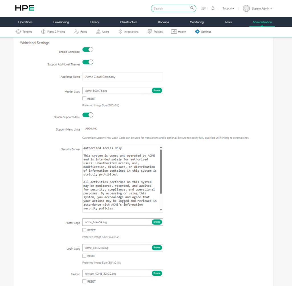
After the settings in this section are made, the following changes are observed in the interface:
- The login screen is completely reshaped with your corporate identity — the logo, background, and texts become yours.
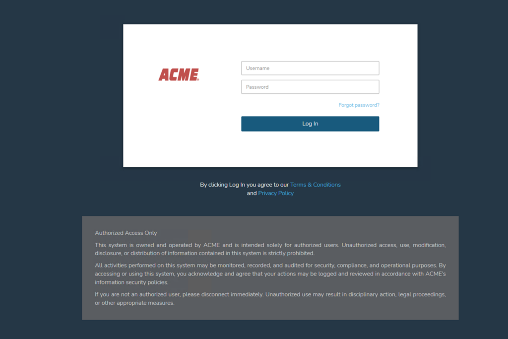
- Once logged in, the Support link in the top right is removed, and your own favicon becomes visible in the browser tab.
- Instead of the HPE logo in the header, your logo is used, and the Appliance Name you defined is used throughout the system in place of “Morpheus“.
The Favicon and Appliance Name sections will change in accordance with the logo and description that were defined.
b) Colors
The Colors settings, which are a continuation of the WhiteLabel section, are the most critical step in achieving a look that is fully aligned with your corporate identity.
After the logo, the element through which the user perceives your brand most strongly is undoubtedly the color palette in the interface.
Each color field can be set in two different ways: by directly entering a HEX code (e.g., #00A982) or visually via the color picker next to it.
By default, all colors come with HPE’s corporate green tone of #00A982 (teal), which makes it easier to visually track what you have changed.
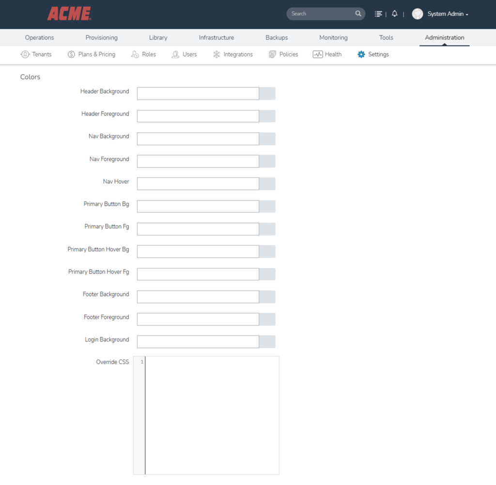
1) Header Background
This field determines the background color of the header area located at the very top of the page. The header section typically contains the logo, search field, notification icons, and user menu.
Using the corporate primary color here strengthens the brand perception of the platform. However, if very dark or very bright colors are preferred, the contrast with text and icon colors must be carefully adjusted.
2) Header Foreground
This is the color of the texts, icons (bell, search, username, etc.), and general text on the header.
The most critical point to pay attention to here is contrast. If you don’t create sufficient contrast with the Header Background (e.g., dark text on a dark background), users will have difficulty reading the texts.
Choosing light (white) text on a dark background and dark text on a light background is the general rule.
3) Nav Background
This is the background of the menu strip containing the main tabs such as “Operations, Provisioning, Library, Infrastructure…”.
By default, it is a dark gray tone close to black, and a dark corporate color is generally preferred.
4) Nav Foreground
This is the text color of the tab names (Operations, Provisioning, etc.) in the navigation menu.
A tone that is compatible with the Nav Background and provides high contrast should be selected.
5) Nav Hover
This is the highlight color that appears when the user hovers the mouse over a menu item or when that tab is active.
For example, the green underline beneath the selected “Administration” tab uses this color.
The most appropriate choice here is generally your corporate primary color or a shade of it.
6) Primary Button Bg
This is the background color of the primary action buttons in the system (Save, Submit, Add, Browse, etc.). Since it needs to attract the user’s attention, the corporate primary color is usually used here.
7) Primary Button Fg
This is the text color on these buttons.
In most cases, white is preferred; however, if your button background is a very light tone, switching to a dark text color produces a more readable result.
8) Primary Button Hover Bg
This is the color the background will turn to when the mouse hovers over the button. A tone slightly darker or lighter than the primary color is usually chosen so that the user clearly senses that the button is clickable.
9) Primary Button Hover Fg
This is the color of the button text in the hover state.
The contrast rule applies here as well — it is important that the text remains readable during hover.
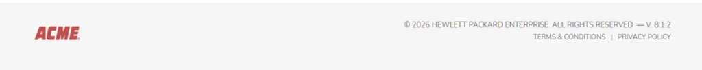
10) Footer Background
This is the background color of the footer strip at the very bottom of the page.
A tone that is consistent with or complementary to the header is generally preferred.
11) Footer Foreground
This is the color of the copyright text, version number, and other informational text on the footer.
12) Login Background
This is the background color of the login page that users encounter when signing in to Morpheus.
Since this screen creates the first impression of the system, it being fully aligned with your brand is even more critical than the other fields.
13) Override CSS
This field is a very powerful customization tool designed for advanced users.
When the ready-made fields offered by the color pickers do not meet your needs, you can write your own CSS code to customize almost every element of the interface.
This field essentially gives you direct intervention authority over the visuals of the platform.
Typical use cases include rounding the corners of certain buttons, defining custom fonts with @font-face, giving alternating background colors to table rows, changing the padding/margin values of specific pages, or adding entirely new styles.
You can see a small example below;
.navbar {
    font-family: 'Roboto', sans-serif !important;
}
.btn-primary {
    border-radius: 12px !important;
}
The use of “!important” is generally mandatory at this point because Morpheus’s own CSS rules take priority over what you write — you need the !important flag to break this priority.
Before using the Override CSS field in a live environment, always test it in a test environment, because a single incorrectly written CSS rule can break the entire interface — it can even prevent users from logging in.
Also note that for the changes to be visible to all users, users may need to clear their browser cache.
Especially after large-scale color or font changes, this step reduces support requests.
When selecting the colors to be used in the Colors section, it is critically important to pay attention to contrast ratios in terms of accessibility.
According to WCAG standards, a contrast ratio of at least 4.5:1 is recommended for normal text and 3:1 for large text.
You can easily check whether you comply with these standards by testing your color combinations with tools such as the WebAIM Contrast Checker.
In addition, using a consistent palette when determining all colors is important for a professional look.
Your corporate primary color, a hover/dark tone of it, and a set of 3-5 colors consisting of neutral colors (gray, white, black) provide more than sufficient and balanced look for most organizations.
c) Copy Settings
This section allows you to customize the written content displayed to users in the Morpheus interface. The word “Copy” here does not mean “duplicate”; it corresponds to the concept of “copywriting” (text content) used in marketing and publishing. In other words, you manage the copyright, legal, and informational texts displayed in the system from this area.
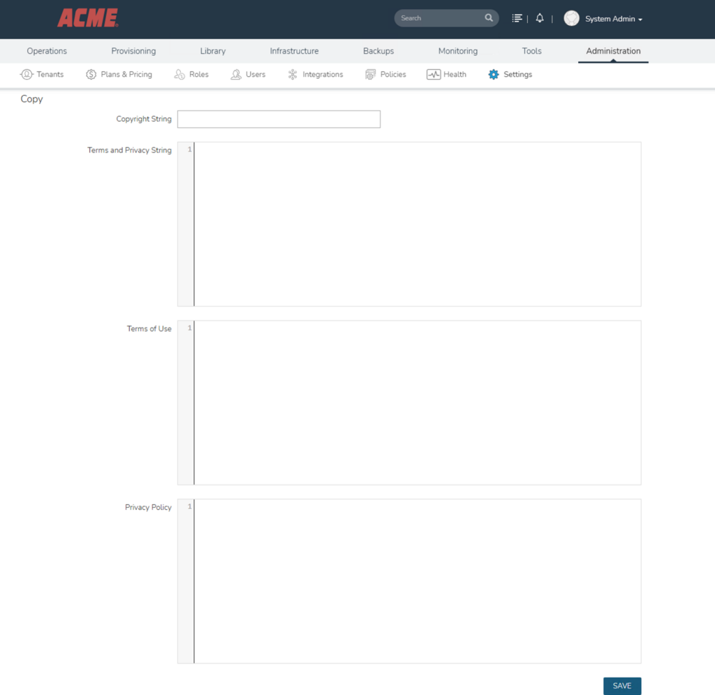
1) Copyright String
This is the copyright text that appears in the footer section at the very bottom of the page.
By default, the HPE or Morpheus copyright text is displayed; by filling in this field, you can display your own organization’s copyright information instead.
The main features of this field are as follows:
- It is a single-line, short text field.
- It is visible on all pages in the system; that is, it is defined once and applies everywhere.
- A combination of the year, company name, and the phrase “All rights reserved” is usually used (for example: © 2026 ABC Technology Inc. All rights reserved).
In terms of display location, it appears in small font at the bottom of every page in the browser.
2) Terms and Privacy String
This is the short informational text users encounter on the login screen.
It typically provides a summary such as “by logging in, you accept the terms” and redirects to the Terms of Use and Privacy Policy documents below.
The main features of this field:
- It is a multi-line text field, but it is still recommended to keep it short (generally 2-4 lines is sufficient).
- Depending on the version, it may support HTML tags, allowing you to embed clickable links within it.
- Since it is located at an eye-catching point such as the login screen, visually heavy and tiring text should be avoided.
In terms of display location, it appears as a small informational area below or beside the login form on the login page.
3) Terms of Use
This contains the full Terms of Use document.
This text forms the basis of the legal agreement between your organization and users. When the user clicks the “Terms of Use” link on the login page, they are taken directly to this text.
Its content typically covers the following headings:
- Scope and definition of the service
- User obligations and responsibilities
- Prohibited uses and abuse situations
- Intellectual property rights
- Service interruption and termination conditions
- Disclaimers and limitations of liability
- Governing law and competent court
The main features of this field:
- It is a long text field; it can easily accommodate content spanning several pages.
- Rich text or HTML format support may vary depending on the version.
- Since it is a legally binding text, it must be reviewed and approved by legal counsel before being published.
4) Privacy Policy
This is the full Privacy Policy document.
This text is not just a corporate preference but also a legal requirement.
Under regulations such as KVKK in Turkey, GDPR in Europe, and CCPA in the USA, you are obliged to clearly explain to users which data is processed and how.
Its content typically covers the following topics:
- Identity and contact information of the data controller
- Categories of personal data collected
- Purposes and legal grounds for data processing
- Sharing with third parties and cross-border transfers
- Data retention periods
- User rights (access, rectification, deletion, objection, etc.)
- Cookie policy
The main features of this field:
- It is a long text field.
- It must include certain mandatory elements for KVKK compliance; an incomplete policy can result in sanctions.
- This text must be updated whenever there is any change in your data processing operations.
After the relevant definitions are made for the three fields above, two notable changes are observed in the user interface.
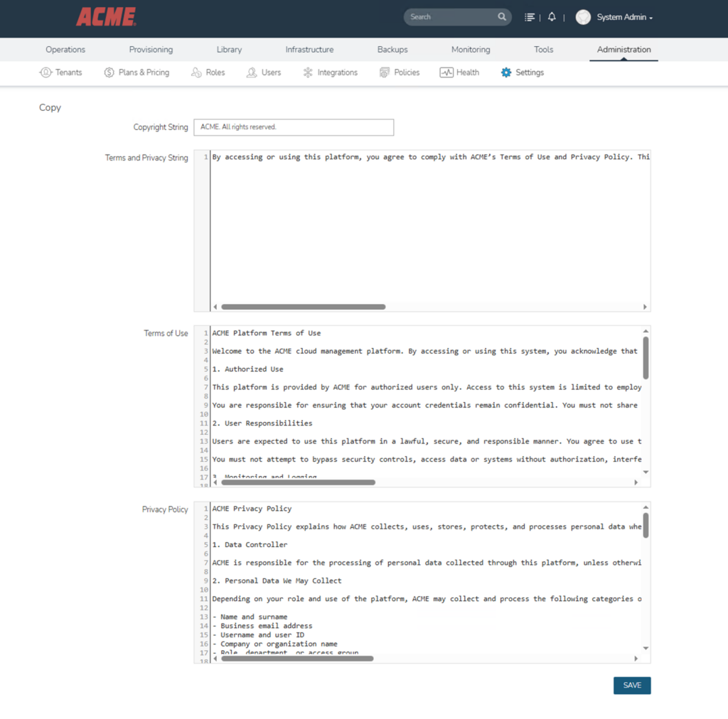
The informational text on the login screen now reflects your own organization’s wording, and in the footer section at the very bottom of the page, your defined copyright text appears in place of the HPE/Morpheus copyright.
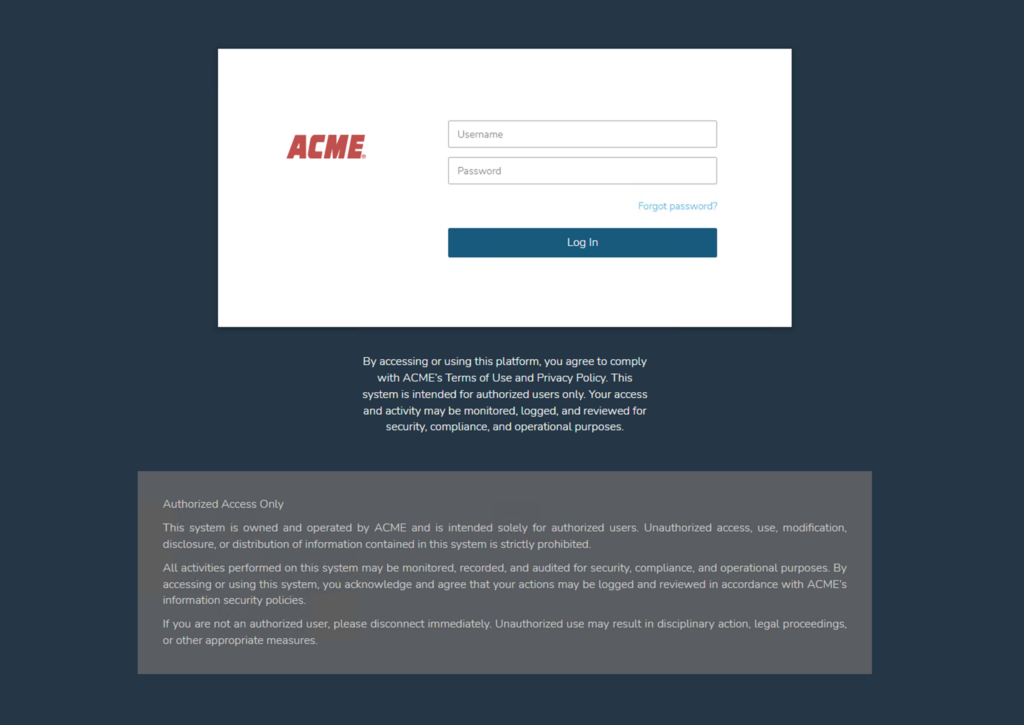

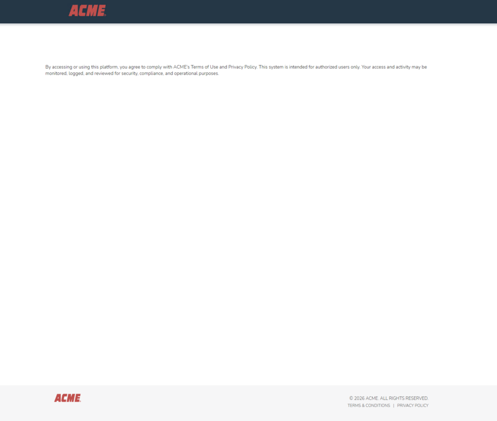
These seemingly small changes are the finishing touches that allow the user to perceive the platform not as “HPE Morpheus” but as your own corporate solution.
![[TR] HPE Morpheus Enterprise WhiteLabel Yapılandırması](https://kadirkozan.com/wp-content/uploads/2026/05/hpe_morpheus-ikona-150x150.jpg)